This project was developed to clearly communicate Rentomojo’s brand identity, core values, and visual language. The brand book and design guidelines serve as a unified reference to ensure consistency across all touchpoints—defining elements like logo usage, color palette, typography, tone of voice, and digital presence.
Both horizontal and vertical logo versions ensure a consistent and professional brand image, adaptable to various marketing materials.
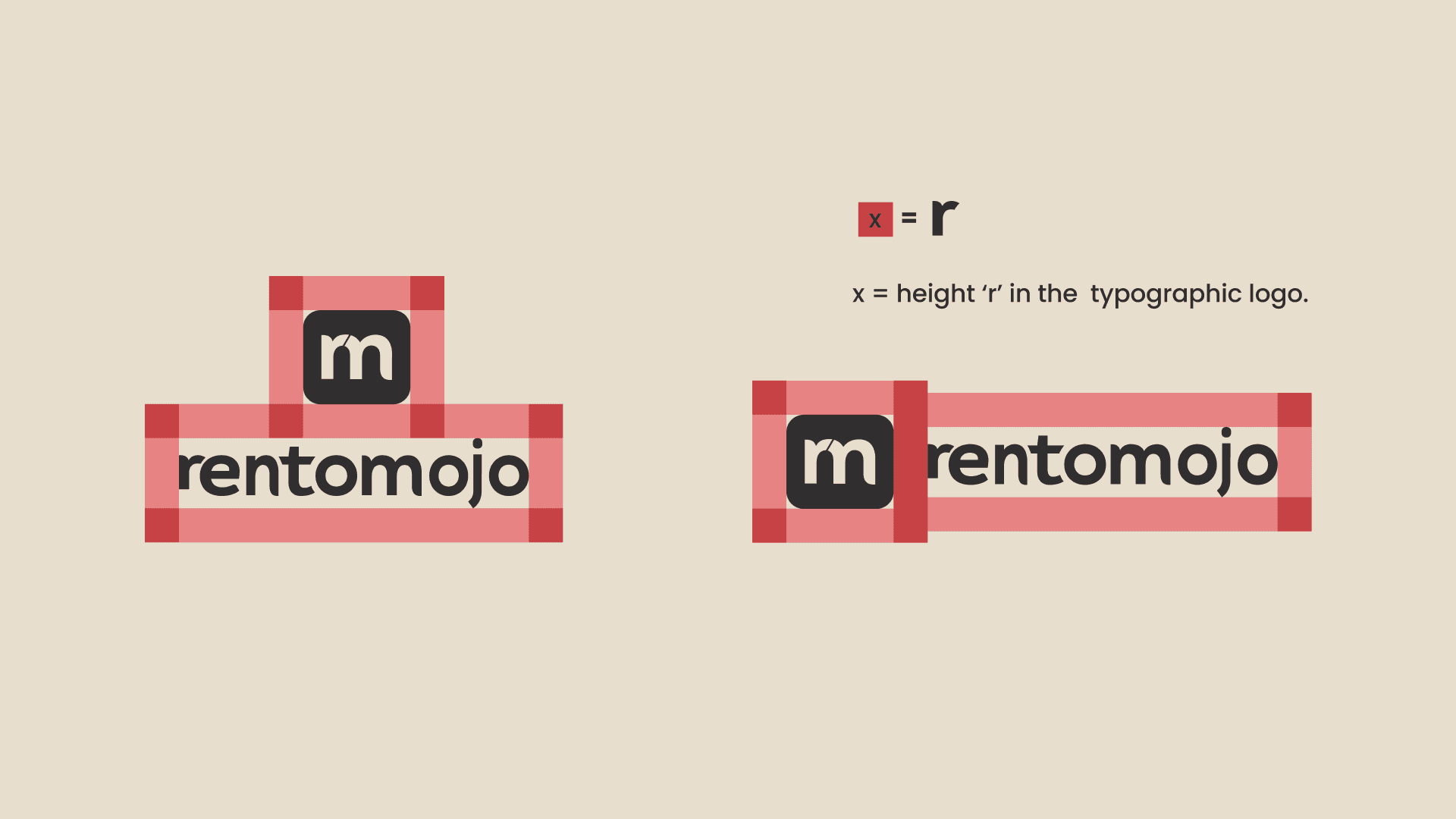
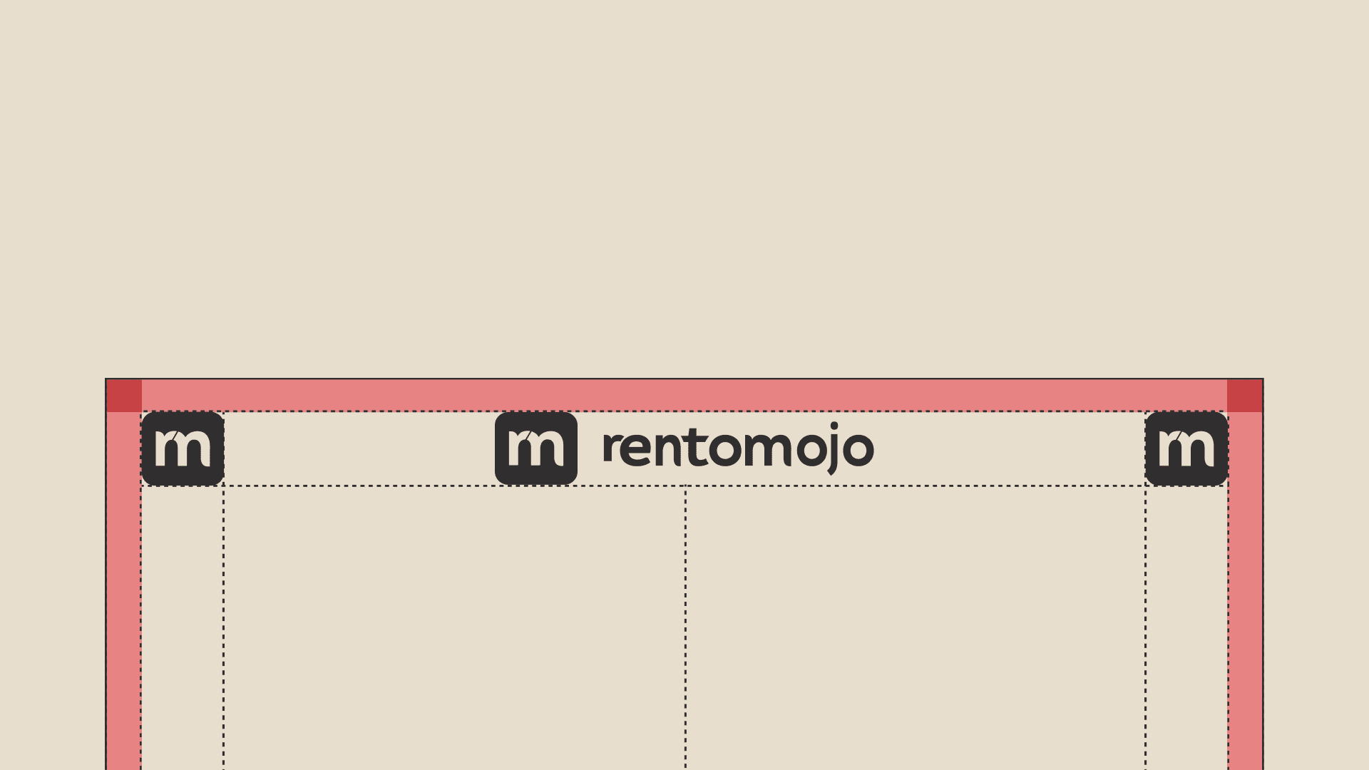
Using the "x-height" of the "r" for clearspace ensures a consistent and readable logo design.
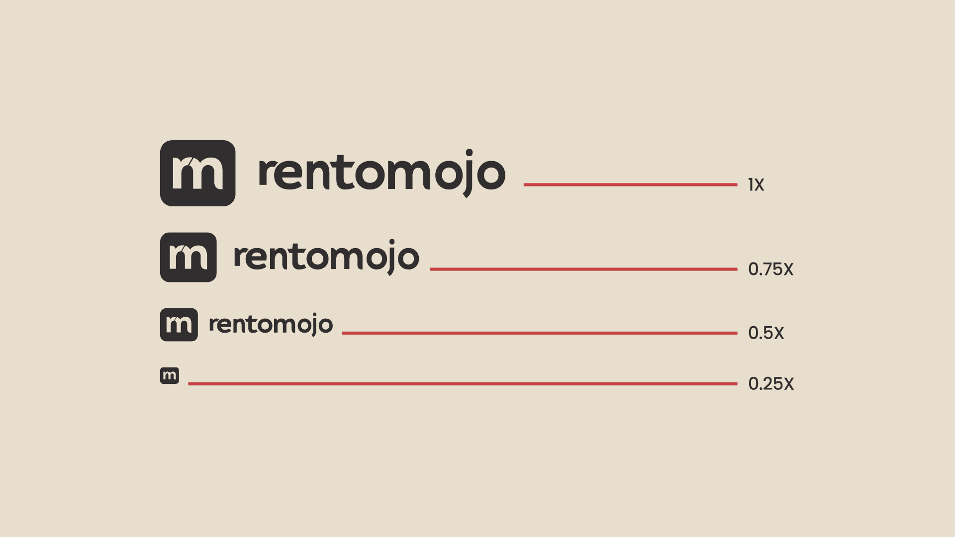
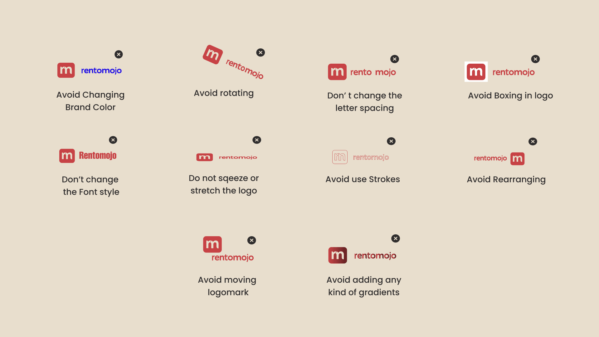
Following these guidelines, can ensure that the Rentomojo logo is used consistently and effectively, maintaining the brand's professional image.
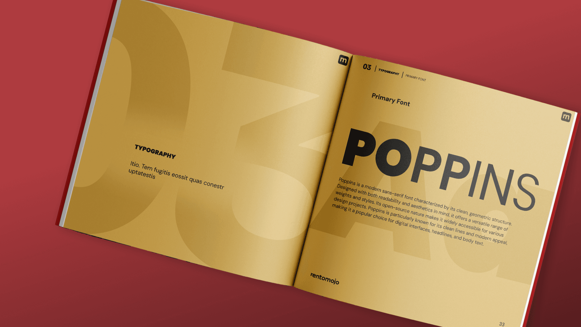
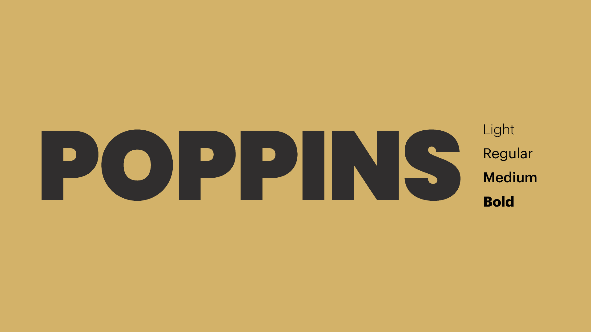
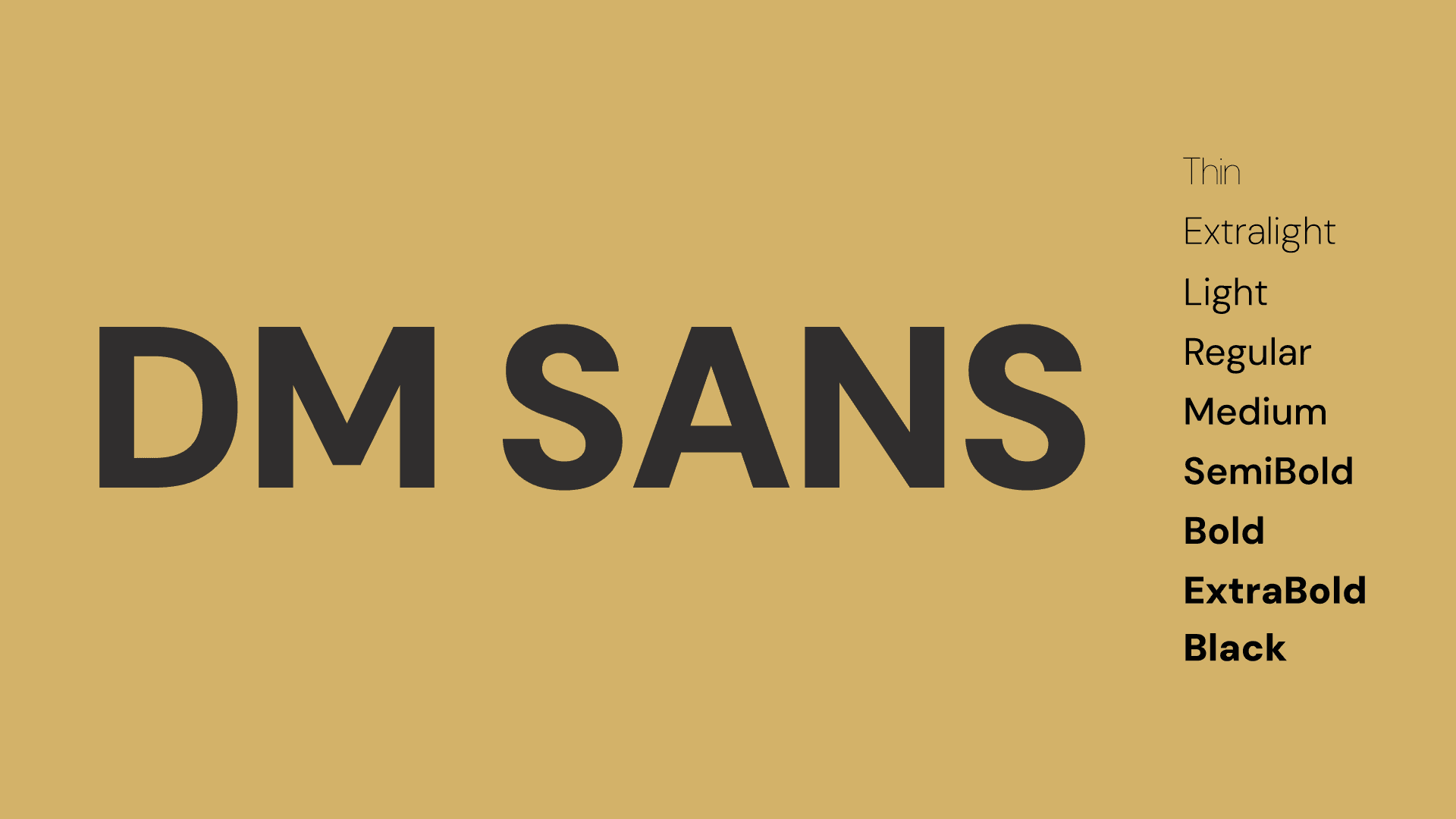
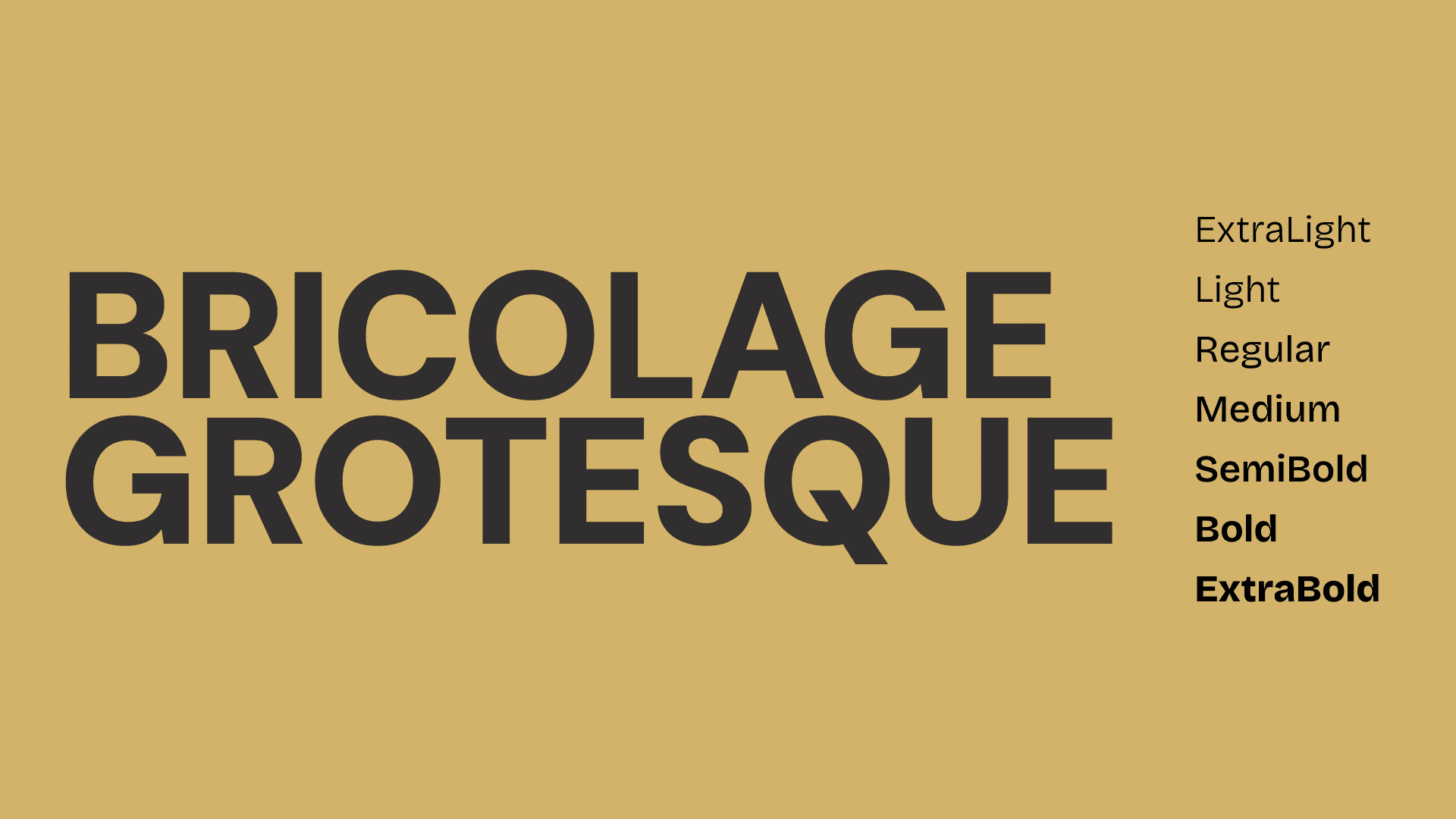
Poppins is a font that's highly readable, modern, and widely supported. Its clean design and range of styles make it a suitable choice for various design projects